


This case study highlights my redesign of the Passport Seva website, focusing on enhancing usability, accessibility, and visual appeal. The existing platform had several challenges, including complex navigation, cluttered information, and an outdated interface, making it difficult for users to efficiently apply for, track, and manage their passports.
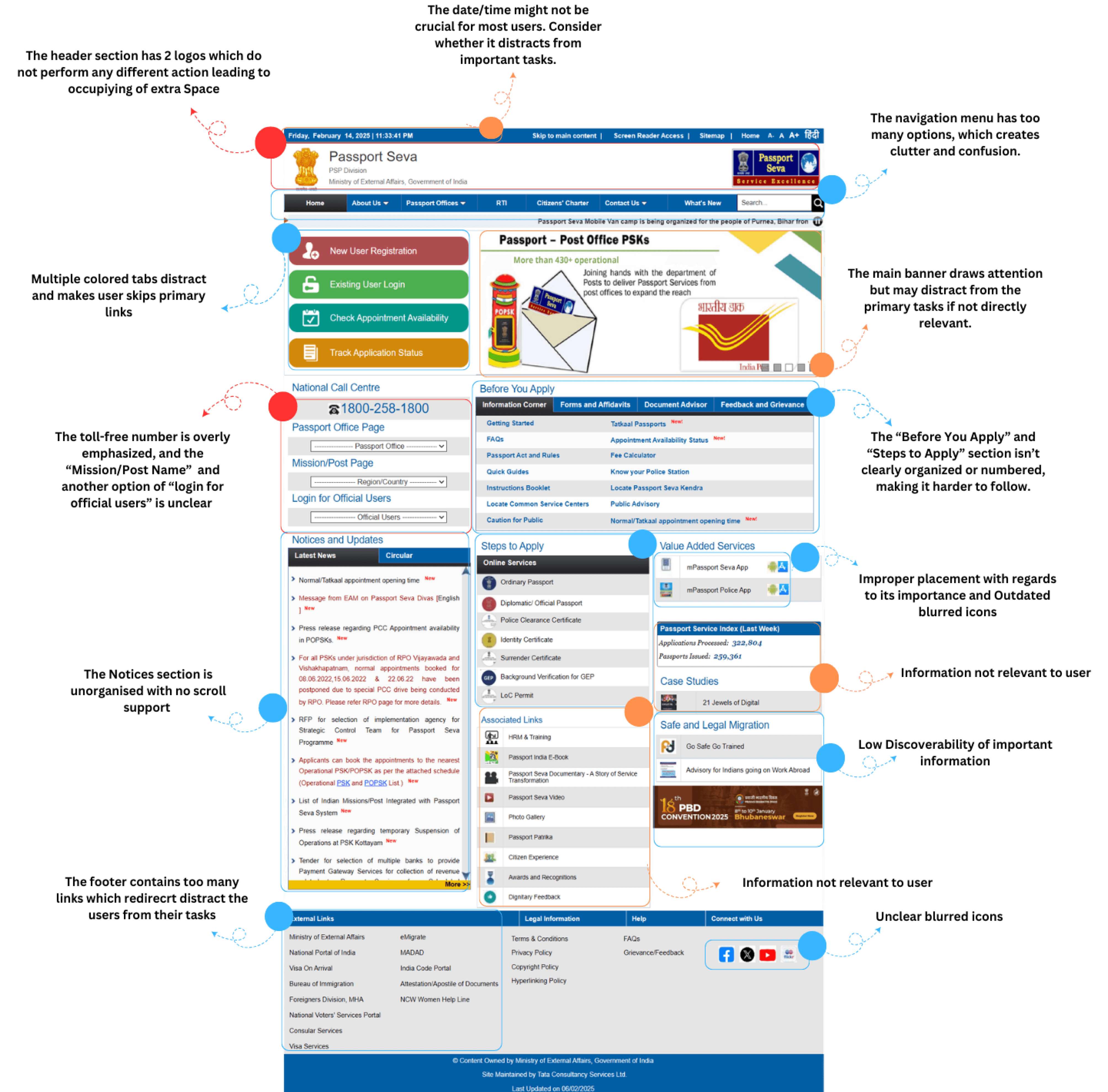
The existing Passport Seva website faced multiple usability issues, making the passport application process confusing and inefficient for users. Complex navigation, cluttered information, and an outdated design led to difficulties in accessing essential services such as applying for a passport, scheduling appointments, and tracking applications.
The lack of a clear visual hierarchy further contributed to user frustration. A redesign was necessary to create a seamless, intuitive, and modern interface that simplifies the process and enhances the overall user experience.
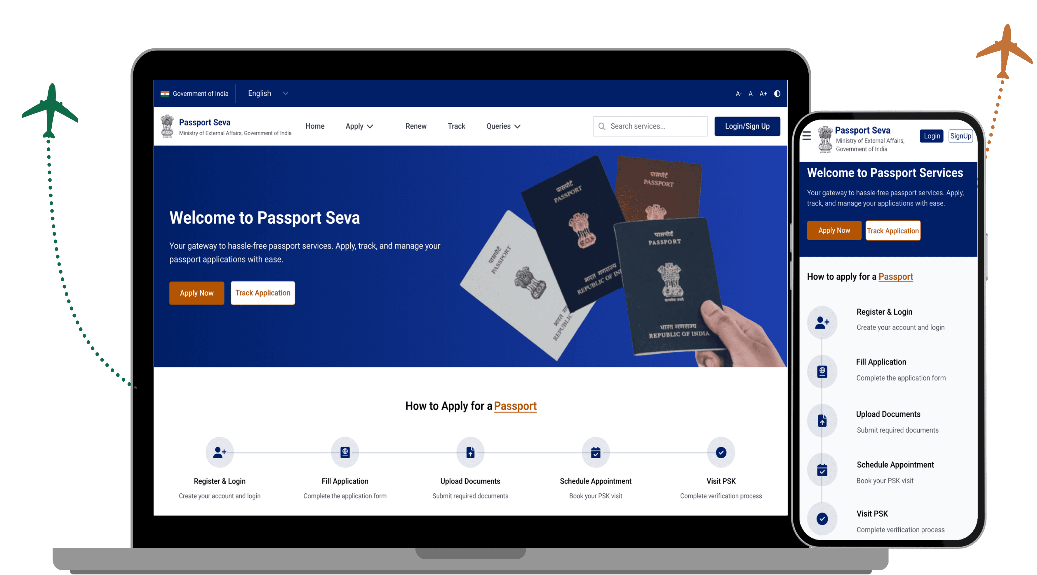
The redesigned Passport Seva portal streamlines the user journey with a focus on accessibility, efficiency, and ease of use. It features intuitive navigation, a structured layout, and clear application progress to guide applicants through each step. The platform is fully mobile-responsive, ensuring a seamless experience across all devices.
Additionally the design also includes a AI support chatbot which will resolve users query by connecting them to the pre trained AI chatbot and connects them to an executive if needed with further help, which provides a user a seamless experience on the spot.
PROJECT
OVERVIEW
PROBLEM
STATEMENT
MY
SOLUTION
Disclaimer: This is not an official redesign of the Passport Seva website. It is a conceptual project aimed at identifying potential issues and proposing simplified solutions. As a UI/UX designer, I undertook this initiative solely for learning and practice purposes.
PROCESS
ANALYSING AND OBSERVING PROBLEM
Redundant
Repetitive elements that cause confusion
Irrelevant/Unnecessary Elements that don’t align with the purpose, audience, or usability
Inconsistent/Distracting
Design choices that break visual harmony or disrupt user focus.
STYLE GUIDE
HOW DID I SOLVE THIS ?
MOBILE RESPONSIVE
COLOR SCHEME
ICONS
Text - Secondary
#6B7280
Background 1
#E5E7EB
Background 2
#FFFFFF
Text - Primary
#E5E7EB
Primary
#001F67
Secondary
#B35400
GATE
01
02
03
FLIGHT
Analyzing Current Passport Seva website and the flow
Performing a UX Audit & observe Problems
Card Sorting
REMARKS
ON TIME
ON TIME
ON TIME
04
05
06
Brainstorming & Iterations
Wireframes
Final Design
ON TIME
ON TIME
ON TIME

REDESIGN PROCESS
OBJECTIVES

CARD SORTING
OUTCOME

I use card sorting to understand how users naturally group and label information as there are various services available at the passport seva website and users may visit the website for various purpose. This exercise helps me ensure that content is organized in a way that makes sense to users. The outcomes include refined content groupings, improved labeling, and a navigation structure that enhances usability and reduces confusion.


Roboto
Bold SemiBold Medium Regular
14PX 16px 18px 20px 24px 36px
A B C D E F G H I J K L M N O P Q R S T U V W X Y Z
a b c d e f g h i j k l m n o p q r s t u v w x y z
0123456789!”#$%^&*()?/,+@-
STYLE GUIDE AIRLINES

FONT FAMILY :
FONT WEIGHTS :
FONT SIZES :

Aa
TYPOGRAPHY
TYPOGRAPHY
pilot details
Scan for


100%
UX Flaws Detected
Scan Completed
0%
Scanning...
UX Flaw
Detector
UX Flaw
Detector
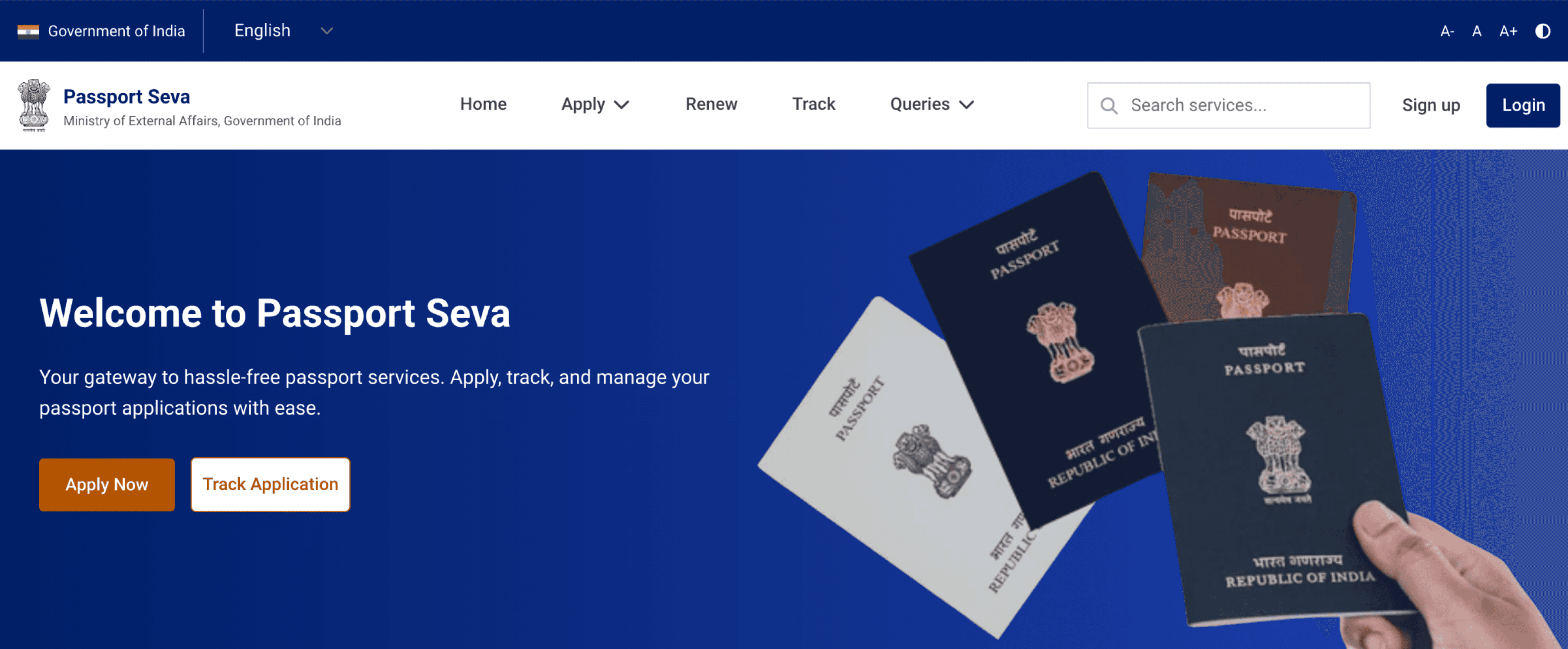
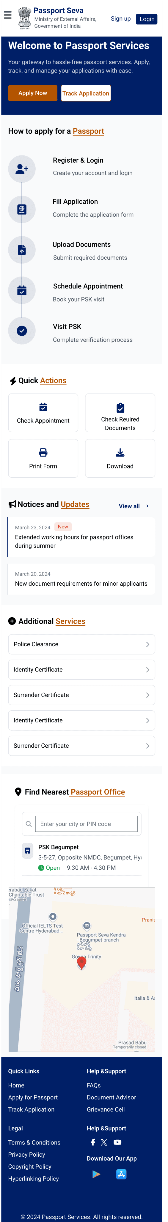
In the hero section I have added Call to action buttons for easy application initiation and reduce the Clutter in the navigation bar and a multi language support option which was previously not available with emphasis on the login& up button For better user access
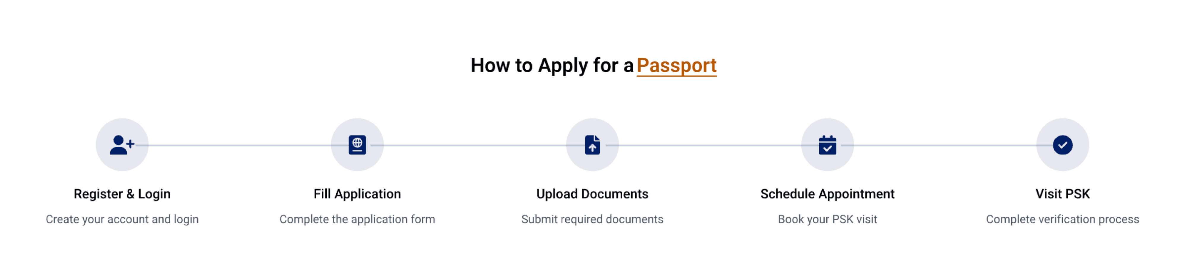
The new five steps section clearly explains the passport application process this addition helps users to understand each step easily improving overall experience and reducing confusion during the application process
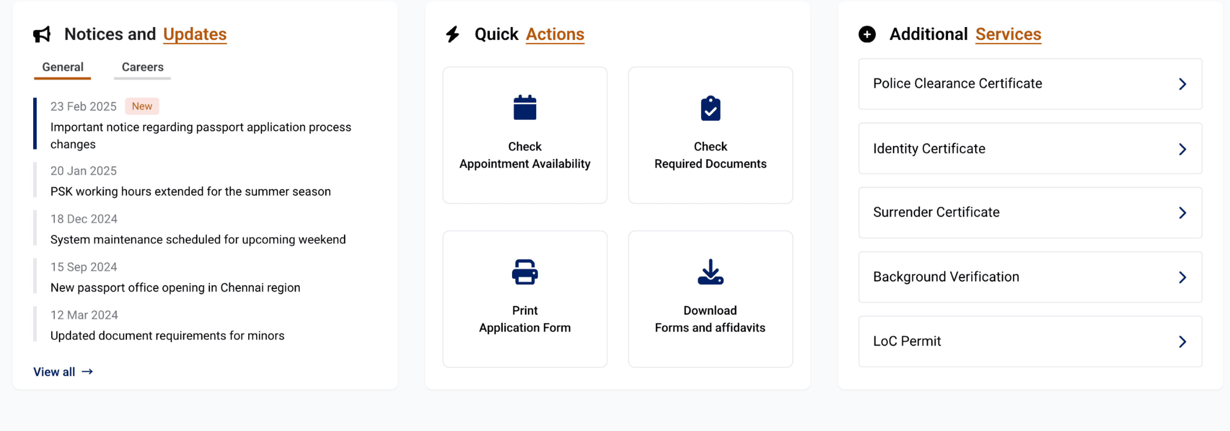
All essential information and services are centralized in one area, enabling users to quickly access updates, tools, and support resources with minimal effort.
An integrated, interactive map now provides precise location details of nearby passport offices, simplifying the process of finding the correct service center. Along with AI powered 24/7 support bot To help users with whatever information they need regarding the passport seva services
The revamped footer reduces the external redirect links clutter and organizes essential links, social media channels, and app download options into a clean layout, offering users immediate access to additional resources and support.
Section by section breakdown of how i solved the existing problems with in my redesign
Hero Section
5 Steps
Information & Services
Nearest Passport OffiNearest Passport OfficeceNearest Passport OffiNearest Passport Officece
Footeer


WHOOPS! Caught in a small-screen web!
This experience is best viewed on a larger screen.
Swing back later on desktop 🖥️ for the full story!